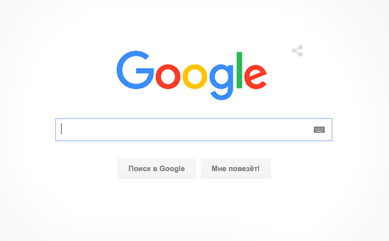
1 September Google changed the logo: now the letters look flat, which corresponds to the modern tendencies of simplification of the interface. About innovations reported in the official YouTube account of the company.

Modifications to the font, additional technical elements. But the whole concept of the image saved is the company name out of six letters and colors. In the message released by Google stressed that a new logo was “easier, brighter, cleaner and more friendly”.
On the search page animated Google Doodle (logo) shows how erased the name, made the old font, and written new. The logo has also changed in other services, such as “news” and “Mail”.

This is the sixth year the company logo (the first one was created in 1997). In the video about the logo change, shows the services that have appeared in different years (“Mail”, “Maps” and others). The story is told in English with subtitles in Russian.
August 11, Google announced a major restructuring: units engaged in the development, far from the Internet business, have been highlighted as a separate company, and they, along with Google, came in holding Alphabet. At the moment, the Alphabet is the second company in the world by market capitalization.


